01
EZPay
EZPay is a payment facilitation platform and a subsidiary of Physics Wallah. It aims to be a one stop solution for all payment related activities and allow users to easily track status of all past and upcoming payments. EZPay provides multiple flexible payment options which allow parents to manage fee payment as per their wish. The project has future plans to integrate a loan provision service that aims to make education accessible for all.
Role:
Product Design
Industry:
FIn-tech
Duration:
12 weeks
Problem Statement
The company wanted to create their own fee collection platform to provide payment options to students, replace existing partners to overall reduce their costs per transaction. With this application, the company plans to cover 70% of the payments that they are collecting from other payment partners and reduce the cost by about 80 to 85%.
As the product designer, my responsibilities encompassed competitor analysis and research based on design of fin-tech products, enabling me to understand the unique needs of our target audience. Leveraging these insights, I conceptualized and designed an intuitive, inclusive website interface.
Methods: UX Research, Sitemap, Wireframing, Mockups, Prototyping, User Testing
Tools: Miro, Figma
Research
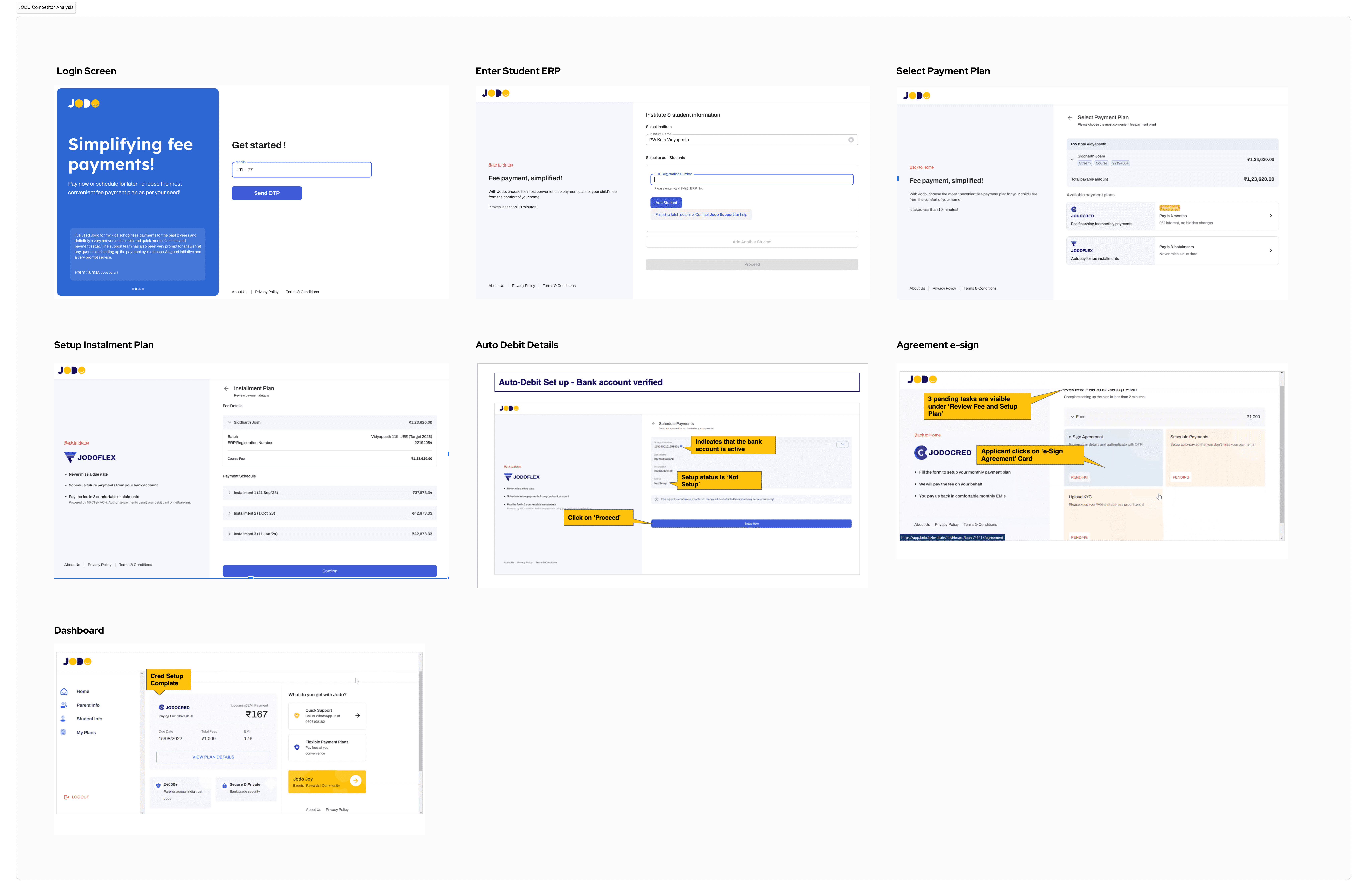
Competitor Analysis
JODO, a prominent competitor offering comparable fee payment plans, presents valuable insights into EZPay's design. By analyzing JODO's strengths and weaknesses allowed me to unveil opportunities for EZPay to stand out and refine its user journey. This included evaluating features, pricing structure, user interface (UI) design, and user reviews to identify areas where EZPay could excel. By understanding JODO's offerings and user feedback, I was able to make informed decisions to refine EZPay’s value proposition, enhance usability, and ultimately attract a wider user base.
Identifying Requirements
User Requirements:
Easy and secure payment processing: Users should be able to pay fees quickly and securely through various payment methods (credit card, debit card, net banking, etc.).
Simplified fee management: Users should be able to easily view all upcoming and past fee payments, including details like amount, due date, and status.
Transparent communication: Users should receive clear notifications and reminders about upcoming fees and any changes in payment status.
Multiple payment options: Users should be able to choose from various payment methods depending on their preference and convenience.
Accessibility and ease of use: The platform should be accessible on various devices (desktop, mobile) and user-friendly for everyone, regardless of technical expertise.
Secure data storage: Users should be confident that their personal and financial information is stored securely within the platform.
Client Requirements:
Cost reduction: Reduce transaction costs by 80-85% compared to existing payment partners.
Streamlined payment processing: Capture 70% of fee payments through EZPay, consolidating previously disparate platforms.
Improved user experience: Provide a user-friendly platform for students and parents to manage fee payments easily.
Data and analytics: Access detailed data and reports on payment trends and user behavior to inform future decision making.
Scalability: Ensure the platform can handle future growth in user base and transaction volume.
Security compliance: Maintain the highest security standards to protect user data and financial information.

Sitemap
To understand the product's vision, I collaborated with the product manager to build a sitemap and evaluate the user's journey.

Design
Colour Palette
Through research on the design of similar products and color psychology suited for a fintech product like EZPay, we decided to use shades of blue as our primary color.
Blue is the most widely used color in the financial sector. It evokes feelings of trustworthiness, dependability, and security—all qualities essential for a payment gateway where users are handling sensitive financial information. It also conveys a sense of professionalism, competence, and intelligence. This can help position EZPay as a reliable and knowledgeable partner in financial transactions.

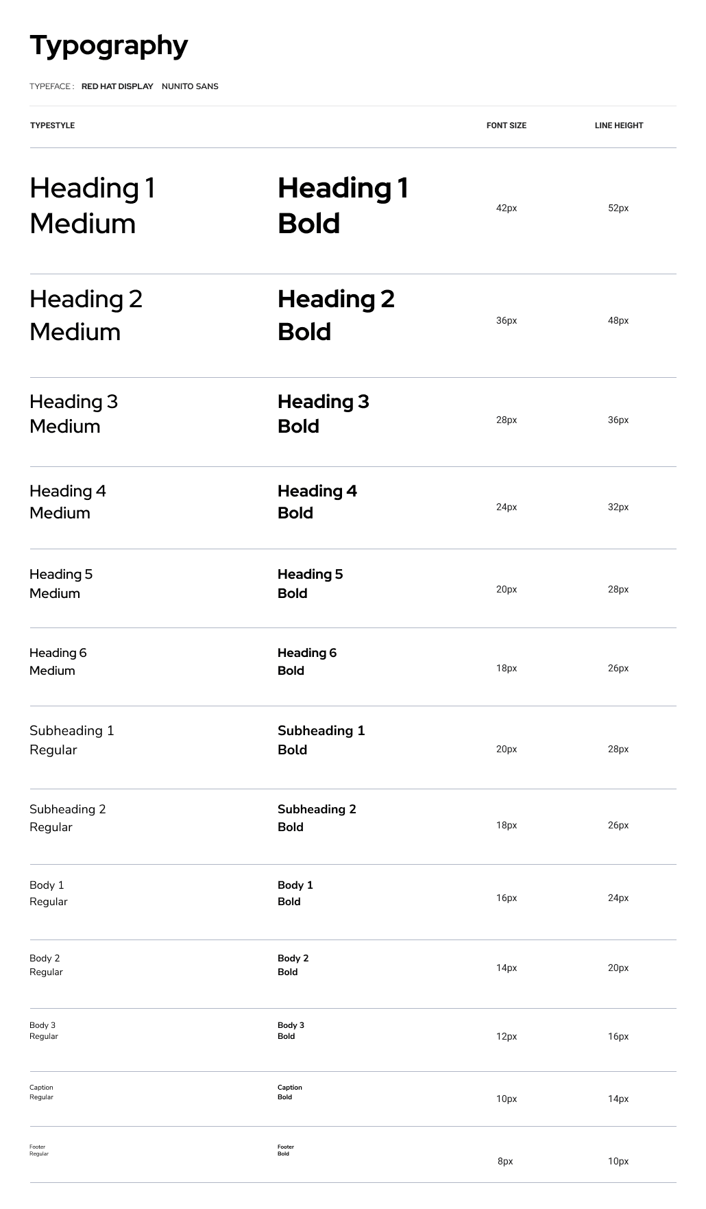
Typography
Red Hat Display (Headings)
Has a contemporary look with slightly rounded edges. It's clean but avoids being overly sterile that contributes to EZPay's professional appearance while still being approachable and friendly for users.
The clear, geometric letterforms ensure optimal readability, even in larger heading sizes.
Nunito Sans (Body Text)
Designed for optimal legibility even at smaller sizes. Its straightforward design is easy on the eyes and facilitates comfortable reading of important financial details.
Has a neutral, unassuming style, which allows information to take the focus. It pairs seamlessly with the slightly bolder and more distinctive Red Hat Display without any clash.
The slightly rounded terminals offer a subtle softness that adds a touch of warmth to the overall interface, making it feel less intimidating.
Other considerations included:
Open Source: Both fonts are open-source, making them cost-effective and widely accessible.
Web Optimization: These fonts are designed with web use in mind, ensuring fast loading times and rendering consistency across devices.
Mock-ups
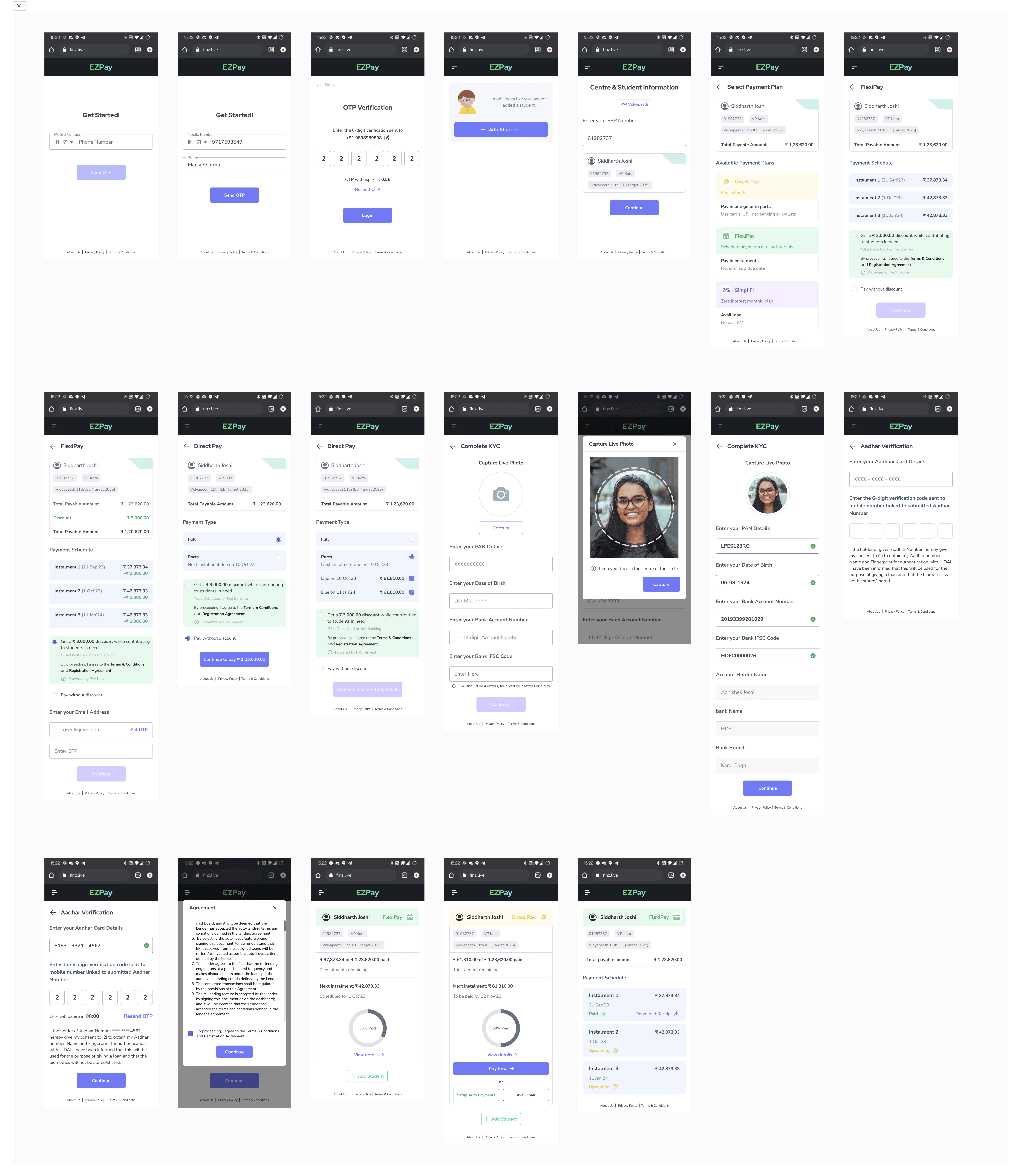
Login Screens
To create a distinctive and unique login flow, a sidebar with illustrations was designed with EZPay's tagline to build trust with the user.
The student onboarding flow is simple and intuitive. Once student details have been fetched, the user is able to select a plan as per their convenience with all details shown up front.

Setting up a FlexiPay Plan
A sidebar and top navigation bar was added to direct the user's attention to the centre- allowing them to focus solely on the payment process. FlexiPay allows the user to pay the fees in pre-determined EMIs. The option to avail an instant discount has been provided, where the amount will be redirected to provide loan to other students in need.

Setting up a Direct Pay Plan
Direct Pay allows the user to make full or ‘part’ payment in one go, without having to set an auto-debit, allowing them more payment options.
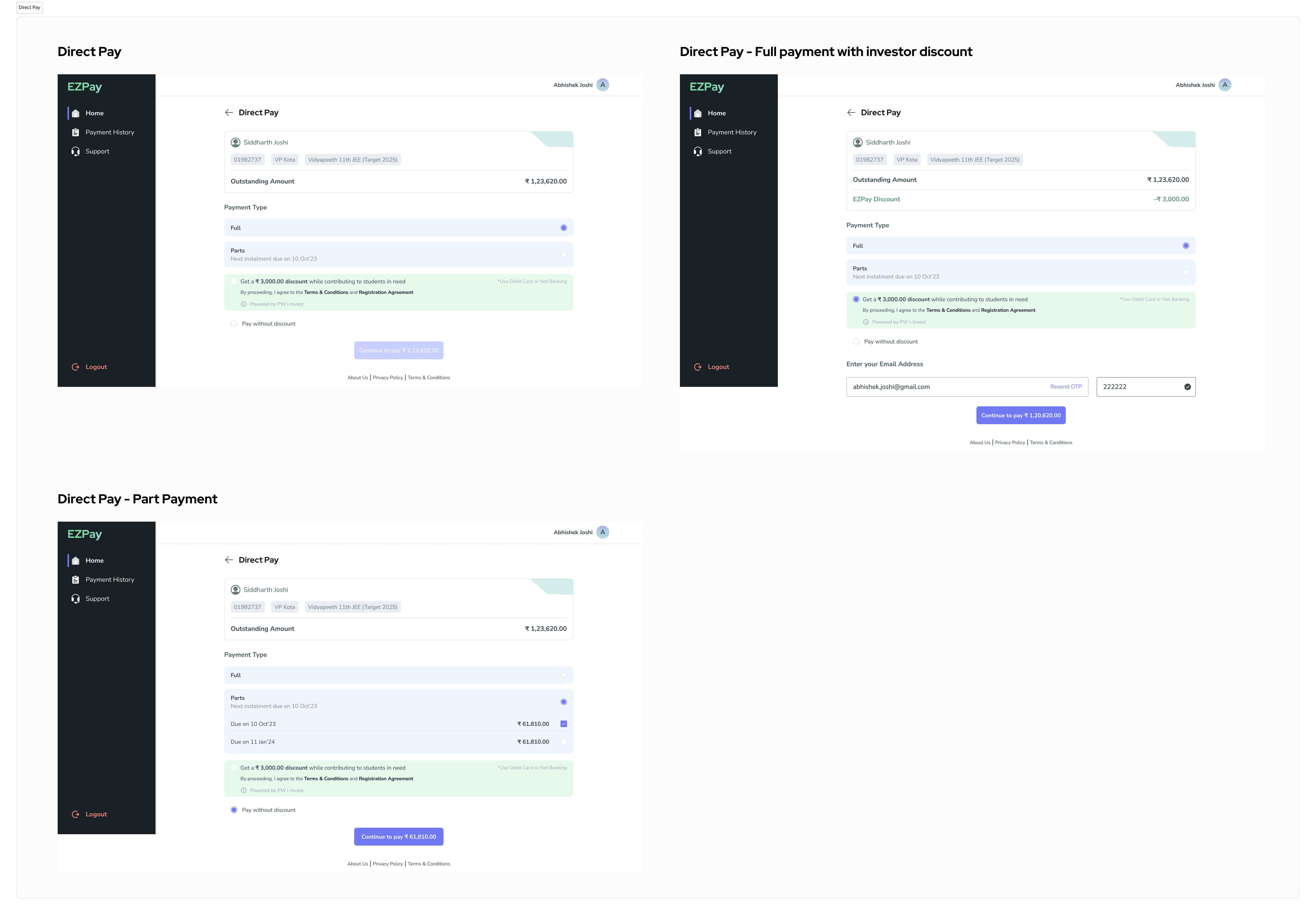
Entering KYC Details (In case the user avails discount)
The user will have to verify their KYC details to avail an instant discount, which includes providing their email address, PAN number, DOB, and bank details. A cKYC check will run after inputting these details upon verification. In case cKYC fails, the user’s Aadhar Number will verified using UIDAI verification. A mandatory agreement must be e-signed before proceeding to payment, which is handled by a third-party portal.

User Dashboard
The default screen after logging in is the dashboard. After setting up any payment plan, the user is directed here where they can check plan and EMI details, payment history or contact the support team.

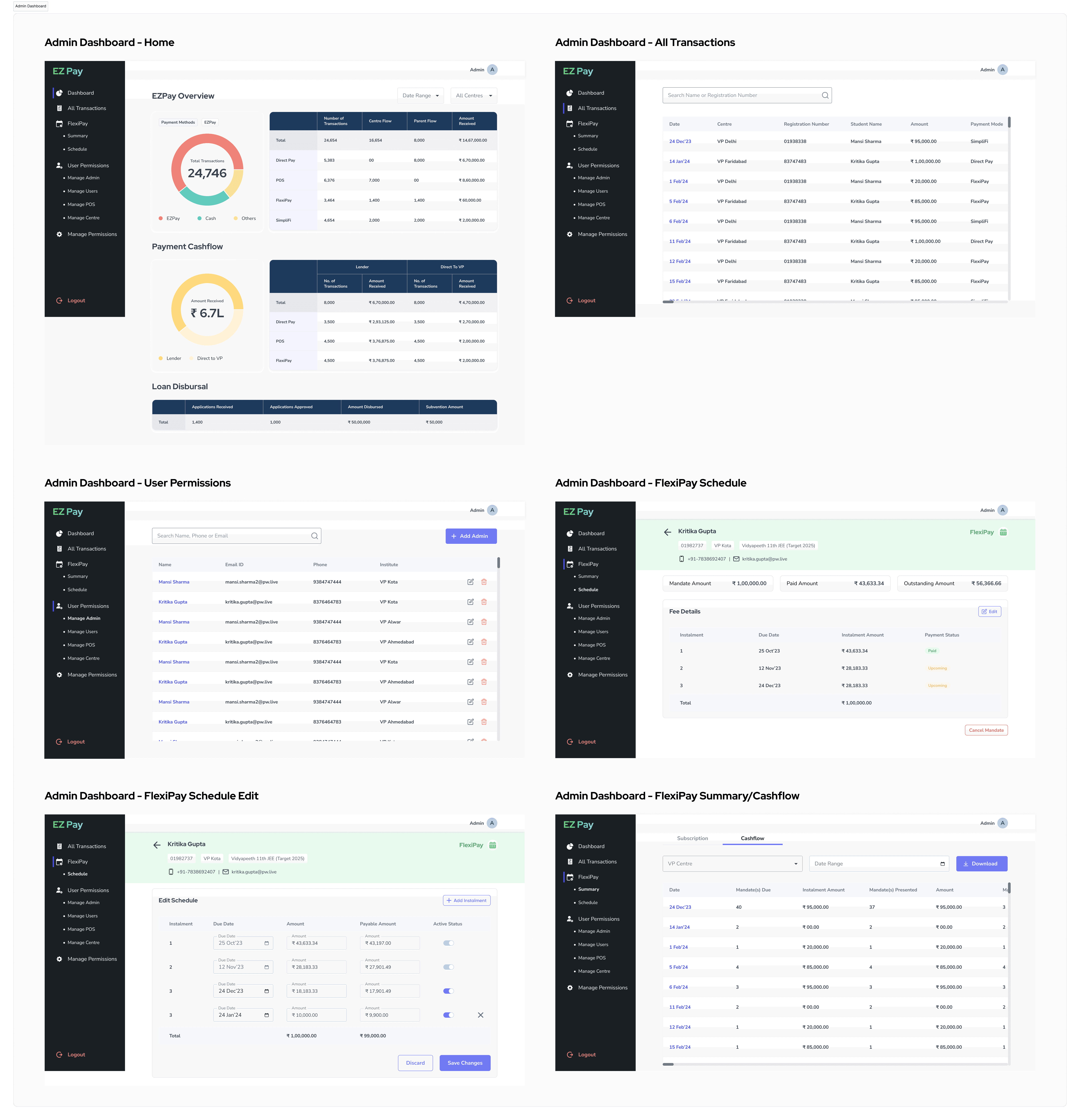
Administrative Dashboard
To analyze data collected from the platform, a separate dashboard was designed for administrative staff. The staff can view detailed data regarding all payment plans, cashflow status as well as active loan disbursals. They also have control to view and manage any student’s FlexiPay plan and manage on-site counselors using EZPay.
Adapting for Mobile View
To provide flexibility for users, EZPay is also accessible using a mobile web view. All screens have been adapted for mobile screen size to ensure consistency.