01
FemNetz
FemNetz serves as a dynamic digital community, offering a safe and supportive space for women to connect, share personal experiences, and extend a helping hand to one another. As the sole UX designer, I designed this project from inception to final design through research, ideation and UX design principles. The project included designing a responsive and intuitive website design, logo design as well as brand guidelines.
Role:
UI/UX + Brand Design
Industry:
Lifestyle & Community
Duration:
28 weeks
Problem Statement
FemNetz was born out of a critical societal need—a lack of a dedicated online space for women of diverse backgrounds and life stages to openly discuss personal issues and access support. Women faced challenges ranging from new motherhood to career transitions, leaving them isolated without a platform to connect, share experiences, or seek expert guidance.
As the UX designer, I played a pivotal role in addressing this need. My responsibilities encompassed extensive user research, enabling me to understand the unique needs of our target audience. Leveraging these insights, I conceptualized and designed an intuitive, inclusive website interface. I also crafted comprehensive brand guidelines, including logo design, to establish a unified visual identity for FemNetz. My role aimed to create a user-centric platform that not only met project goals but also made a profound impact on the lives of women seeking support, connection, and empowerment.
Methods: Surveys, User Personas, Site Mapping, Logo Design, Branding, Wireframing, Prototyping
Tools: Adobe Photoshop, Adobe Illustrator, Miro, Figma
Research

Competitor Analysis
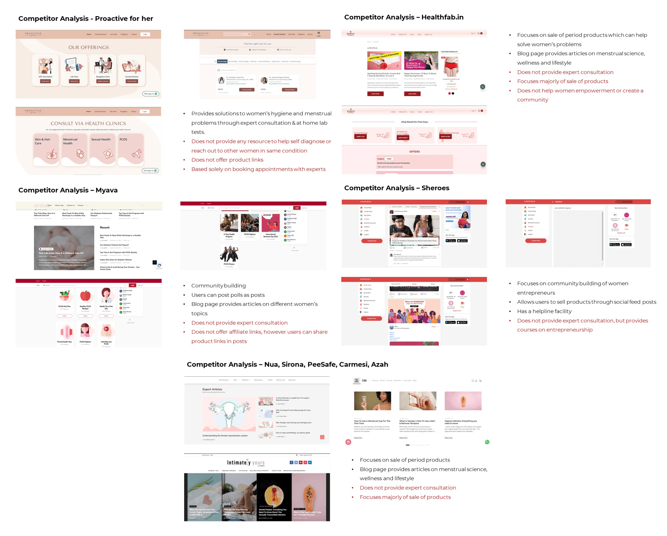
To get a better understanding of the competitor landscape, I conducted analyses to gain insights into existing websites and apps catering to women's needs and concerns such as Proactive for Her, Nua, Sheroes, HealthFab, MyAva, Sirona, Peesafe, and Carmesi. This analysis encompassed a range of factors, including user experience, features, visual identity, and the overall tone of these platforms. What became evident was that while these platforms offered various products and services targeted at women's health and wellness, none of them featured a dedicated women's community discussion forum. This was a significant gap in the market, as it highlighted the absence of a space where women could openly and candidly discuss their thoughts, experiences, and issues.
Surveys
To understand how women discuss their problems, seek medical consultations and connect with other women, I conducted surveys among my friends and family. These surveys were instrumental in gaining early insights and feedback and provided valuable qualitative and quantitative data that informed user personas, user stories, and feature prioritization. By involving my friends and family, I ensured a diverse range of viewpoints, which helped in creating a more user-centred and inclusive design.
Key findings & Insights
The surveys and interviews helped me understand more about the perception of the user, their needs and requirements.
1. While the primary function of the website is to build a global community for women, it also focuses equally on providing discrete access to experts. The inclusion of ‘Circles’ (group consultation/discussion sessions) acts as a bridge to both these functions.
2. Providing resources such as articles, videos and recommended products will ensure women that are able to access the consultations due to financial or other reasons are able to inform themselves about various issues regarding a wide variety of topics and products that might be of use to them.
3. The provision of an online tracker/journal might be beneficial for women who want to maintain a record of their consultations and also provide them with a secure space to write down their thoughts and track their progress, while allowing experts to share online prescriptions and notes after each session.

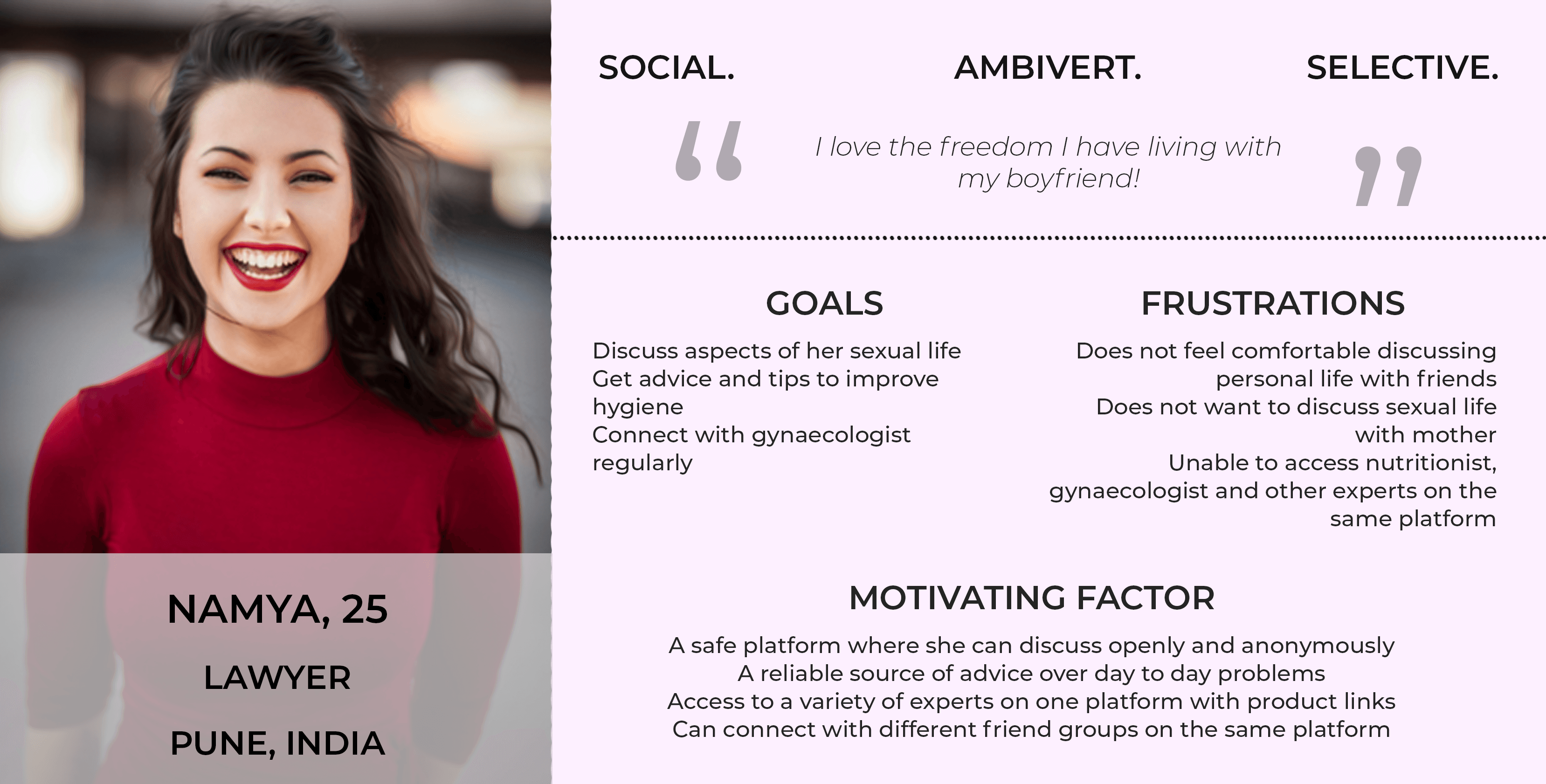
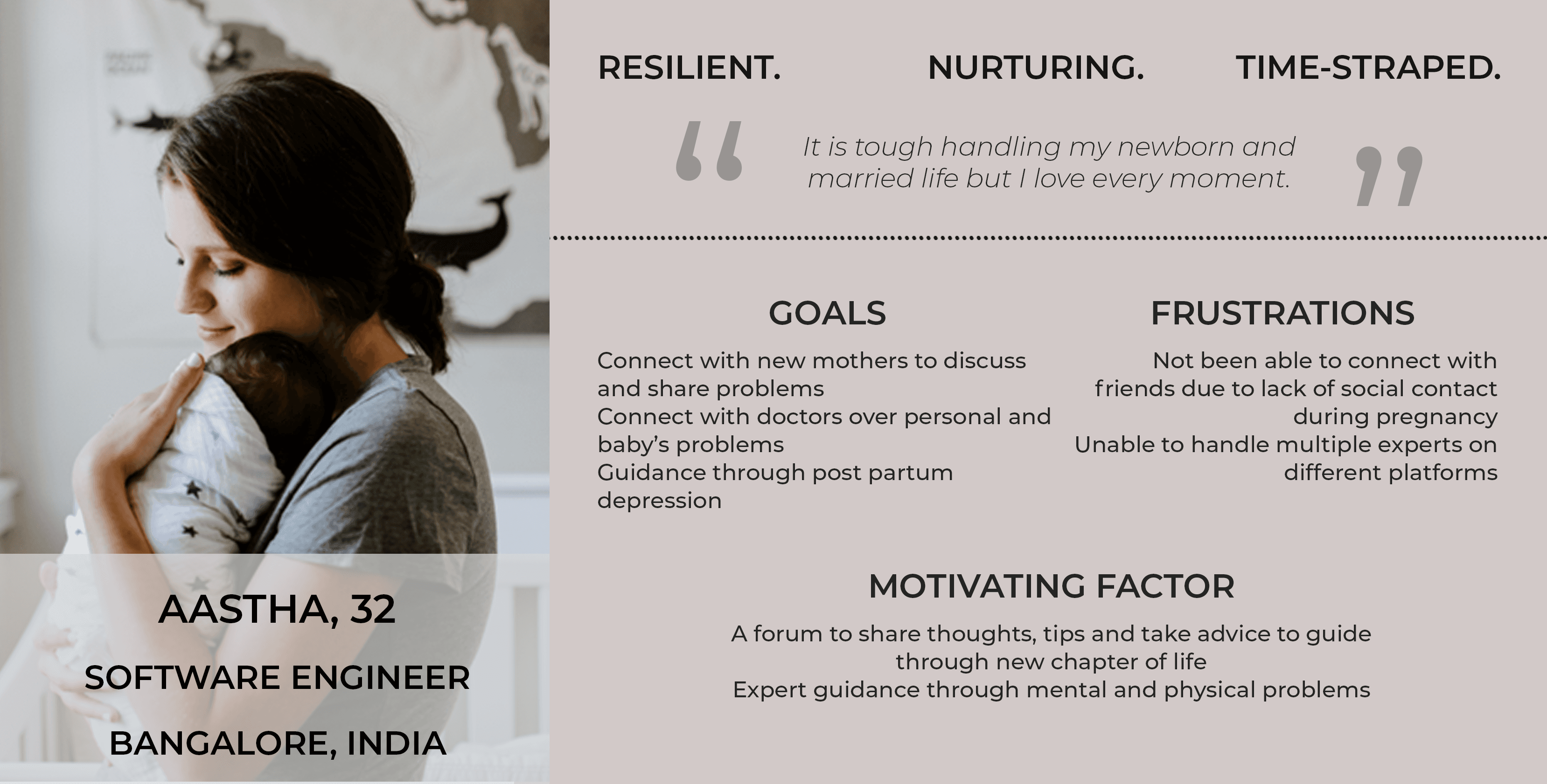
User Personas
I developed a range of user personas, each representing different needs and experiences within the community. These personas served as invaluable tools throughout the project, helping to keep the user experience at the forefront of the design process.
From women seeking to connect with others and explore shared experiences to those enthusiastic about engaging in discussions on various topics, these user personas helped me maintain a user-centric perspective. I revisited and refined these personas regularly, ensuring that the evolving design addressed the unique needs and frustrations of FemNetz's diverse user base.
Minimum Viable Product (MVP)
I gathered requirements to define what features I needed to design for the website. I developed key user stories (from my personas) and minimum viable products (MVPs).
The MVPs would allow me to quickly test to my initial designs on users, giving me valuable feedback early in the design process and to address any concerns right from the beginning.
MVP Needs:
MVP Need #1: I want a platform where I can discuss personal problems anonymously
Feature Requirements: An open discussion board where women can freely share their experiences, advice others and grow independently
MVP Need #2: I want to consult experts over problems I’m facing in day-to-day life.
Feature Requirements: An expert consultation feature which allows users to access a variety of experts that can help guide women in all stages oflife, in all aspects of life.
MVP Need #3: I want to read up on articles about specific personal problems from a reliable source.
Feature Requirements: A resource centre- a collection of curated articles, visuals and videos of experts talking about various problems &their solutions.
MVP Need #4: I want to connect to peers and experienced women who share similar problems as me.
Feature Requirements: An open discussion board where women can freely share their experiences and connect with other women going through the same problems.
MVP Need #5: I would like to purchase specific period products I was recommended by an expert.
Feature Requirements: Affiliate links to products prescribed by the experts to e-commerce sites (such as Amazon, Nykaa, Carmesi, Sanfe, Nua, etc.)
MVP Need #6: I want to filter posts about a specific topic.
Feature Requirements: Filter option to select specific category of discussion
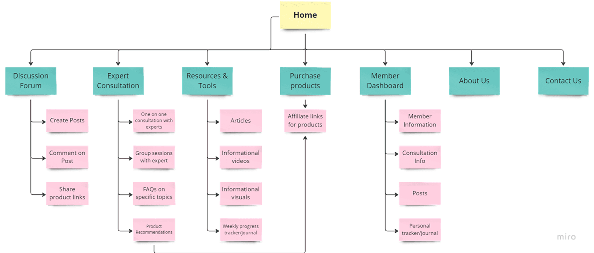
Sitemap
I created a sitemap and flow diagram keeping in mind the functional requirements and conducted a card sort to gain insight as to how the users might expect the content to be organised and displayed, and used the results to create a sitemap.
Design
Mood Board
I presented the client with multiple mood boards and colour palettes. The client gravitated towards having a clean, feminine and minimalistic feel while have a bold impact. After multiple revisions and discussions over the look and feel of the website, a feminine mood board was finalised having earthy tones and a clean, seamless imagery.
The creation of mood boards helped me visualise the environment I was aiming for throughout the design process.


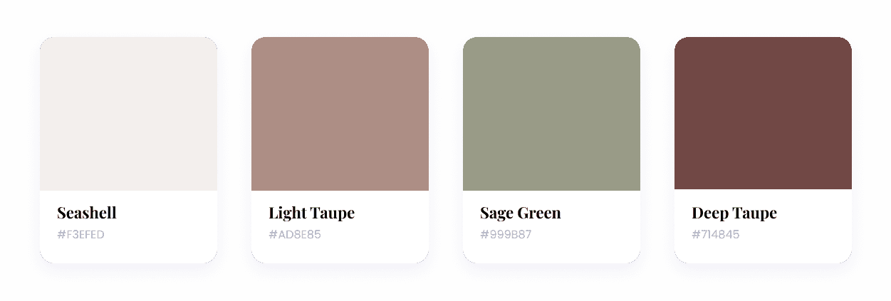
Colour Palette
The colour palette is a harmonious blend of soft, inviting tones that resonate with the brand's essence. It consists of a gentle light beige, a soothing light mauve, a fresh sage green, and a deep, empowering maroon. These colours were carefully selected to evoke a sense of warmth, inclusivity, and empowerment.
Light beige and mauve create an inviting and calming atmosphere, making users feel welcome and at ease. Sage green symbolizes growth, renewal, and connection—perfect for fostering a supportive community. The deep maroon adds a touch of boldness and strength, empowering users to share their thoughts and experiences confidently.
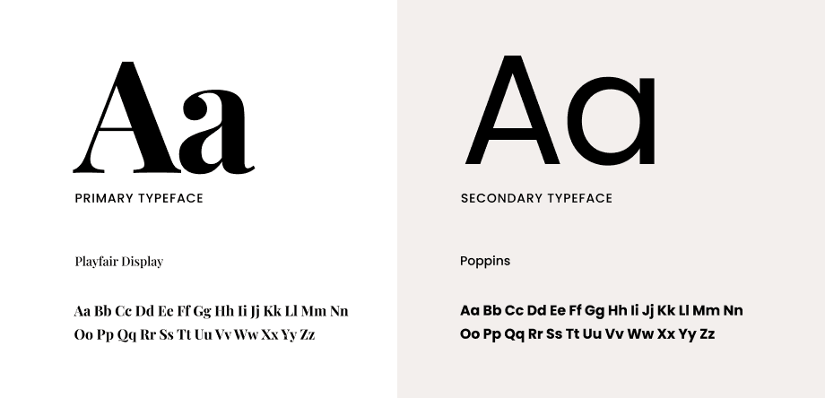
Typography
A well-thought-out typography combination can enhance readability and evoke a balanced sense of elegance and modernity. The primary font, "Playfair Display," is a sophisticated serif typeface that adds a touch of refinement to the design. Its timeless and classic appearance conveys trustworthiness and professionalism.
In contrast, the secondary font, "Poppins," is a clean and contemporary sans-serif typeface known for its readability and versatility. It brings a modern and approachable feel to the design. The contrast between the serif and sans-serif fonts strikes a harmonious balance. "Playfair Display" offers a touch of tradition and reliability, while "Poppins" ensures clear and legible content, creating a visual harmony that suits FemNetz's brand identity perfectly.\
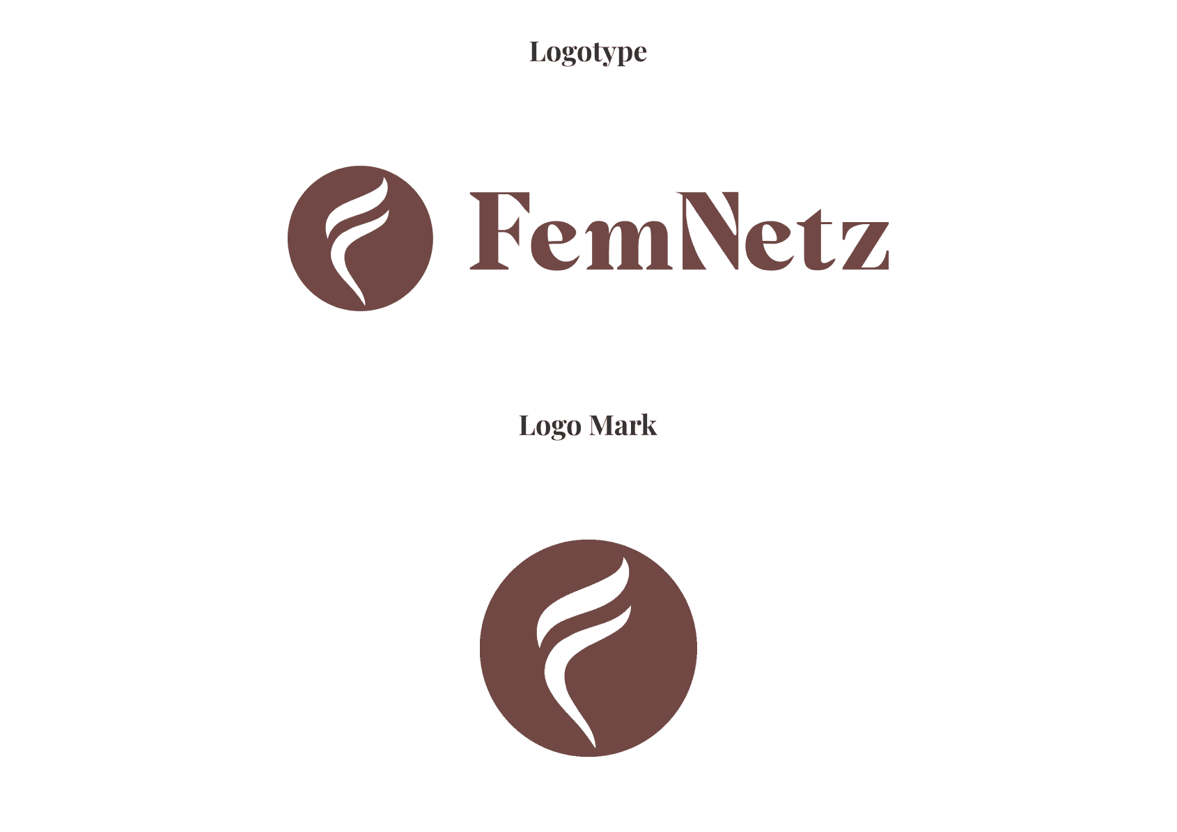
Logo
The logo for FemNetz is an embodiment of the brand's essence, characterized by an elegantly designed, feminine "F" with distinct curves forming the top horizontal lines. This design choice not only represents the initial letter of "FemNetz" but also subtly symbolizes the interconnectedness and support found within the FemNetz community.

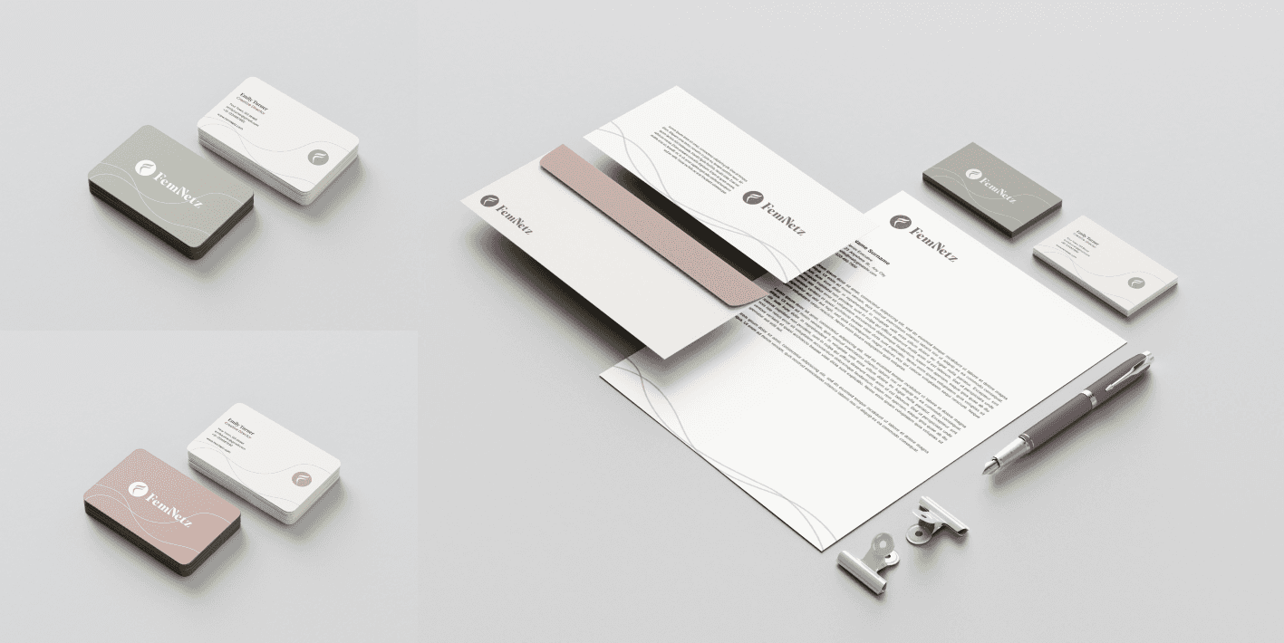
Brand Collaterals
FemNetz's brand collaterals, including business card designs and letterheads, embody the platform's cohesive visual identity. The business cards, featuring the distinctive logo and colour palette, project professionalism and warmth. Meanwhile, the letterheads prominently showcase the logo and utilize the brand's colour palette to ensure consistency in official communications.
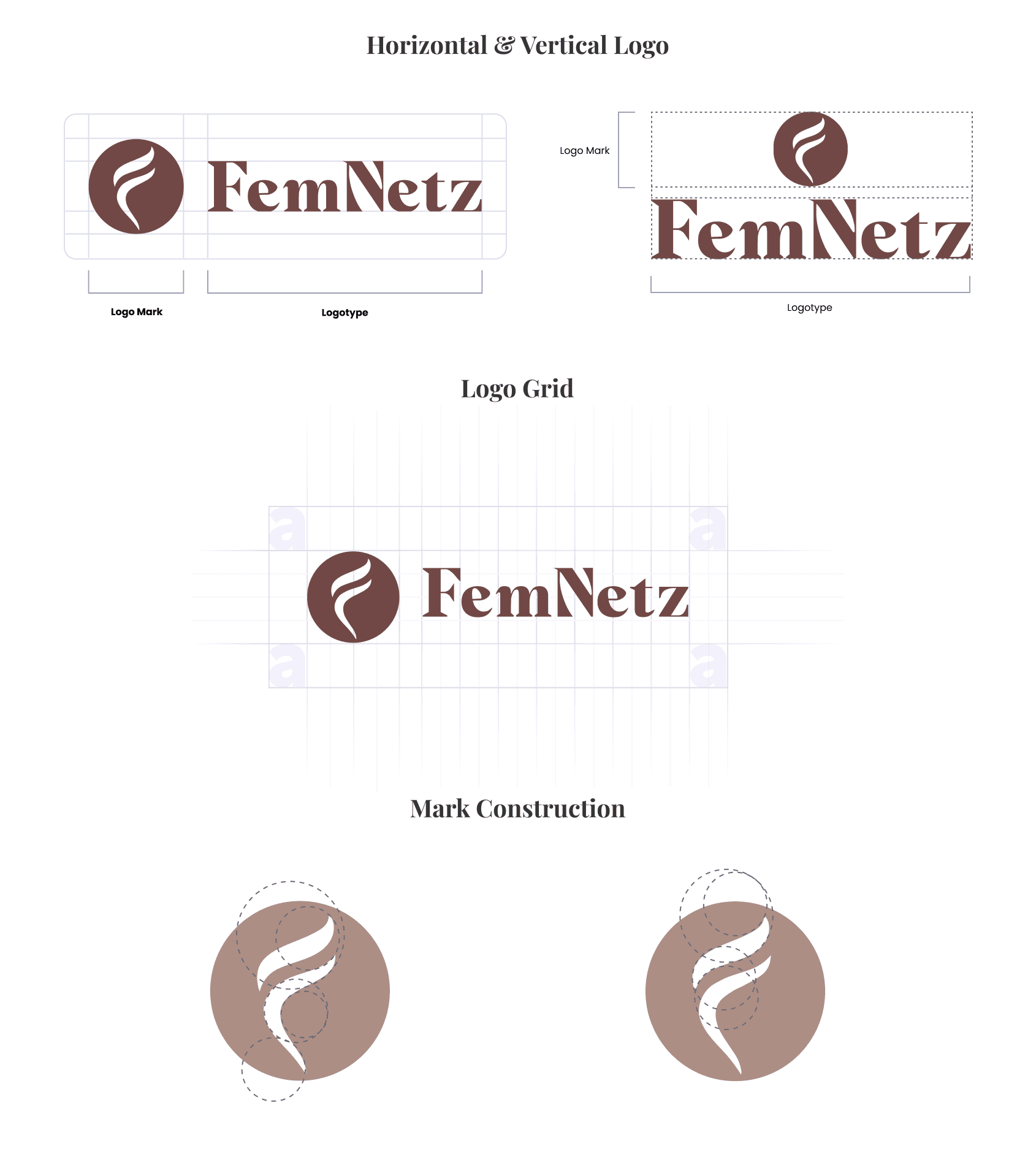
Design System
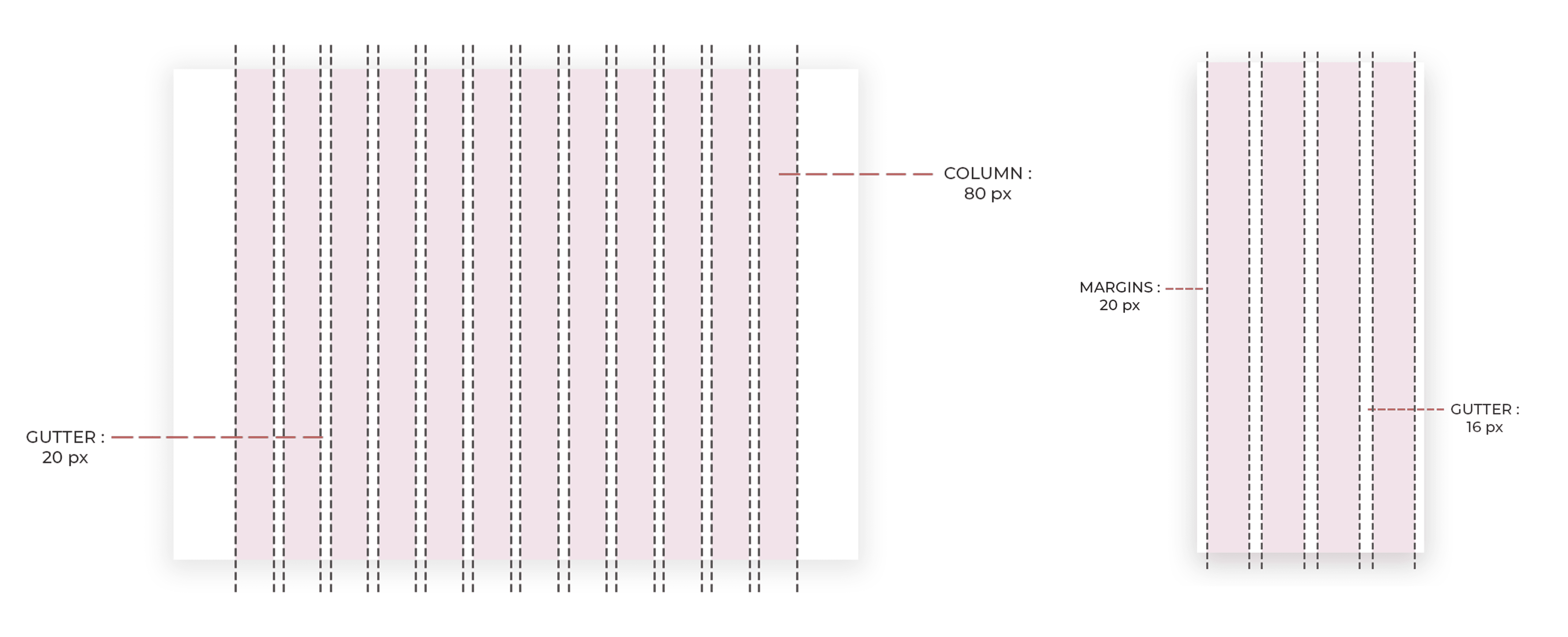
A meticulously crafted grid system was developed to ensure consistency and responsiveness across various devices. The desktop version features a 12-columngrid with columns spanning 80 pixels in width and 20-pixel gutters. This grid provides the flexibility needed for desktop layouts while maintaining visual harmony and readability.
On the mobile web, a 4-column grid with centred columns was implemented. Each column has a 20-pixel margin, and 16-pixel gutters ensure a balanced and visually pleasing layout on smaller screens. This responsive grid system guarantees that FemNetz's content and user interface elements are presented in an organized and user-friendly manner, regardless of the device used.
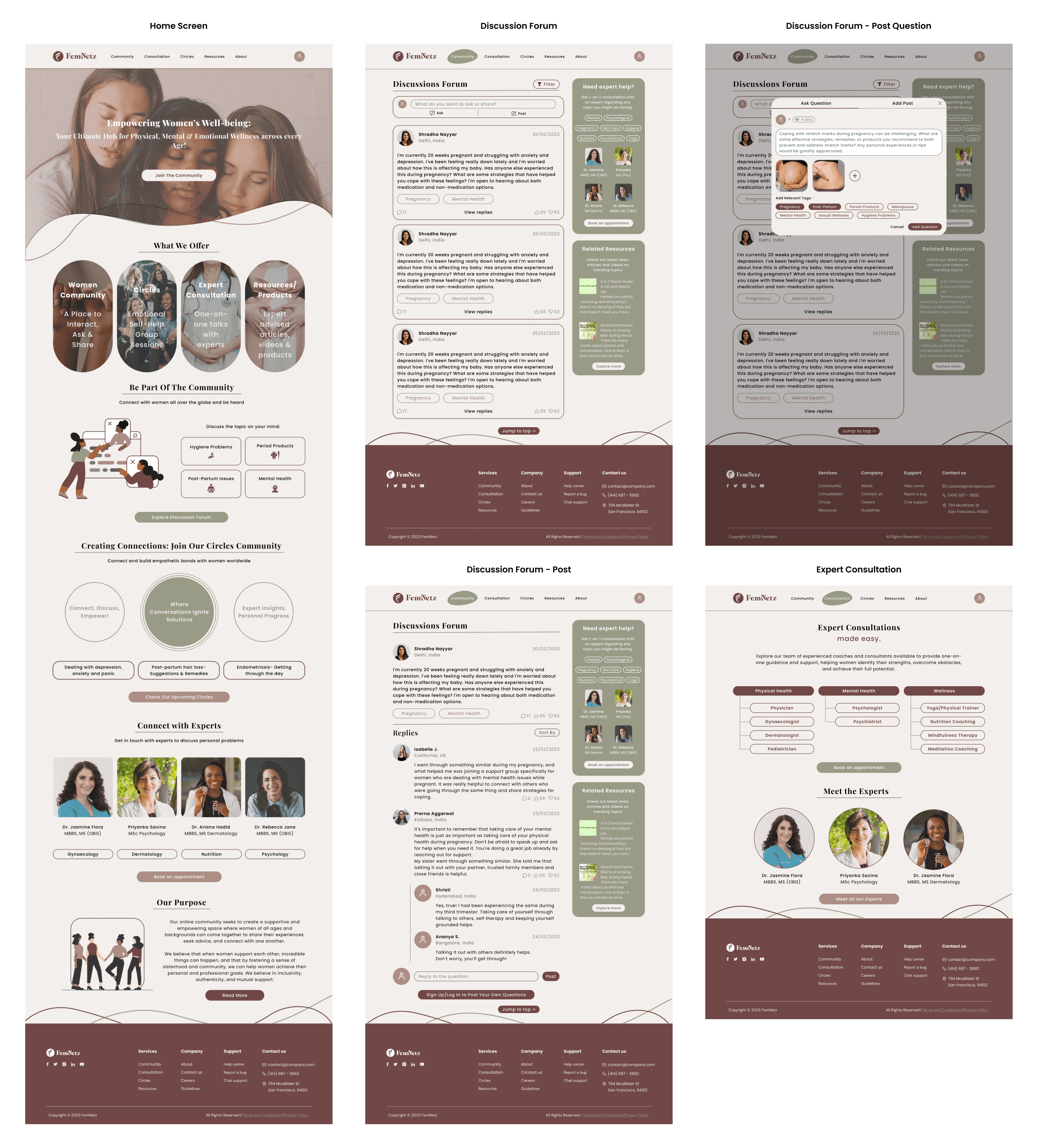
Mock-ups


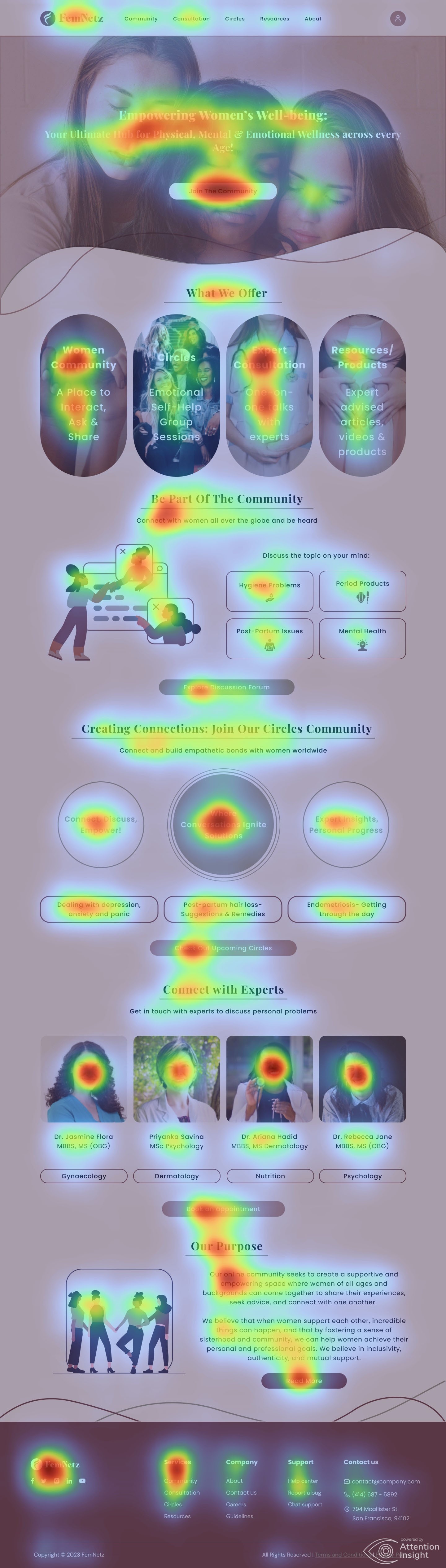
Heat Map Testing
Heat map testing of the home page mock-up revealed that users' attention was drawn to the vibrant logo and key navigation elements, validating their prominence. The heat map also indicated that the engaging visuals and clear call-to-action buttons effectively guided user interaction and exploration, enhancing overall usability and user engagement.
Brand Guidelines
