House of Friends (hoffr) is a community-based app which allows close friends to stay connected throughout the day by sharing personal content and interact freely with friends and other communities to build long lasting bonds which transform into an online neighbourhood. I was responsible for the UX Design of the app during my internship at Dichroic Labs LLP. As the sole UX designer, I designed this project from foundation to final design through research, ideation and UX design principles.
Role:
Ui/UX Design
Industry:
Community
Duration:
12 weeks
Problem Statement
Social media and messaging apps do not provide the privacy and safety required by adults to share private content freely with close friends. House of Friends aims to become a platform where a family-like community can express themselves freely and to build stronger bonds, which can create a ‘portable home’.
I was tasked to design the app interface using UX Design principles for a user-friendly and engaging platform, fostering connections among close friends and communities in the digital realm.
Methods: Surveys, Card Sort, Site Mapping, Wireframing, High Fidelity Mock-ups, Prototyping.
Tools: Adobe Illustrator, Adobe Photoshop, Miro, Figma
Research

Competitor Analysis
I conducted extensive research to inform the design process. One crucial aspect of this research was a competitor analysis, where I closely examined similar apps, notably Discord, to understand their strengths and weaknesses. I also examined content organization, performance, mobile responsiveness, accessibility, and community engagement metrics. I identified that Discord had a very similar structure of servers as required by the client. This allowed me and the client to understand and design the basic structure of the app and its working.
By summarizing strengths, weaknesses, opportunities, and threats and benchmarking against industry standards, I ensured that hoffr's UX design not only met user expectations but also stood out in the competitive landscape.
Surveys
Surveys were conducted tailored specifically to the middle-aged population. These surveys were thoughtfully crafted to delve into the unique preferences, habits, and challenges faced by this demographic when it comes to staying connected with friends and communities through digital platforms.
By engaging directly with our target audience, we gathered valuable insights that were particularly relevant to middle-aged users. The survey findings served as a compass in the design process, ensuring that hoffr addressed the distinct needs and expectations of this age group.
Key Findings & Insights
The surveys and interviews helped me understand more about the perception of the user, their needs and requirements.
I recognized that middle-aged users had diverse preferences and levels of familiarity with social apps, necessitating a tailored approach. Privacy was a significant concern, with users wanting assurance when sharing personal content. To address this, I focused on robust privacy features. Clear communication was vital, as not everyone understood the app's concept, so I ensured that information about hoffr's benefits was easily accessible. I also drew valuable lessons from competitor apps, allowing me to differentiate hoffr and enhance the user experience. By studying community engagement metrics from similar apps, I designed features to encourage interaction and foster stronger connections. Lastly, by gathering direct feedback from middle-aged users, I crafted a user-friendly platform that met their preferences and needs, making it an ideal space for building lasting bonds within online communities.
The user needs I listed to summarise were:
• A close knit and trustworthy place to share with mutual understanding
• Ability to choose who enters the ‘house’
• Connect with close friends over chat
• A separate app to share content (pics, videos, music, docs) freely
• A cloud-based upload link to share content
• Connect through voice or video calling
• Share real time moments by going live
• Connect to other ‘houses’ for large scale social interaction through a ‘guestroom’
• Interact with members one-on-one
User Personas
hoffr focuses on a diverse range of middle-aged individuals of different demographics seeking family like interactions. The personas were developed to reflect varying degrees of concern about privacy when sharing personal content with friends and levels of familiarity with social apps. Since the users have a wide range, I created user personas in order to remind myself of the needs and perception of my users, and to maintain a user-centric focus for the duration of the project.
I revisited these user personas often in order to remind myself of the needs and frustrations of my users, and to maintain a user-centric focus for the duration of the project.
Outlining the Scope
I gathered requirements to define what features I needed to design for the app. I developed key user stories (from my personas) to list out my content and functionality requirements.
Listing out the specific focus points would allow me to quickly test to my initial designs on users, giving me valuable feedback early in the design process and to address any concerns right from the beginning.

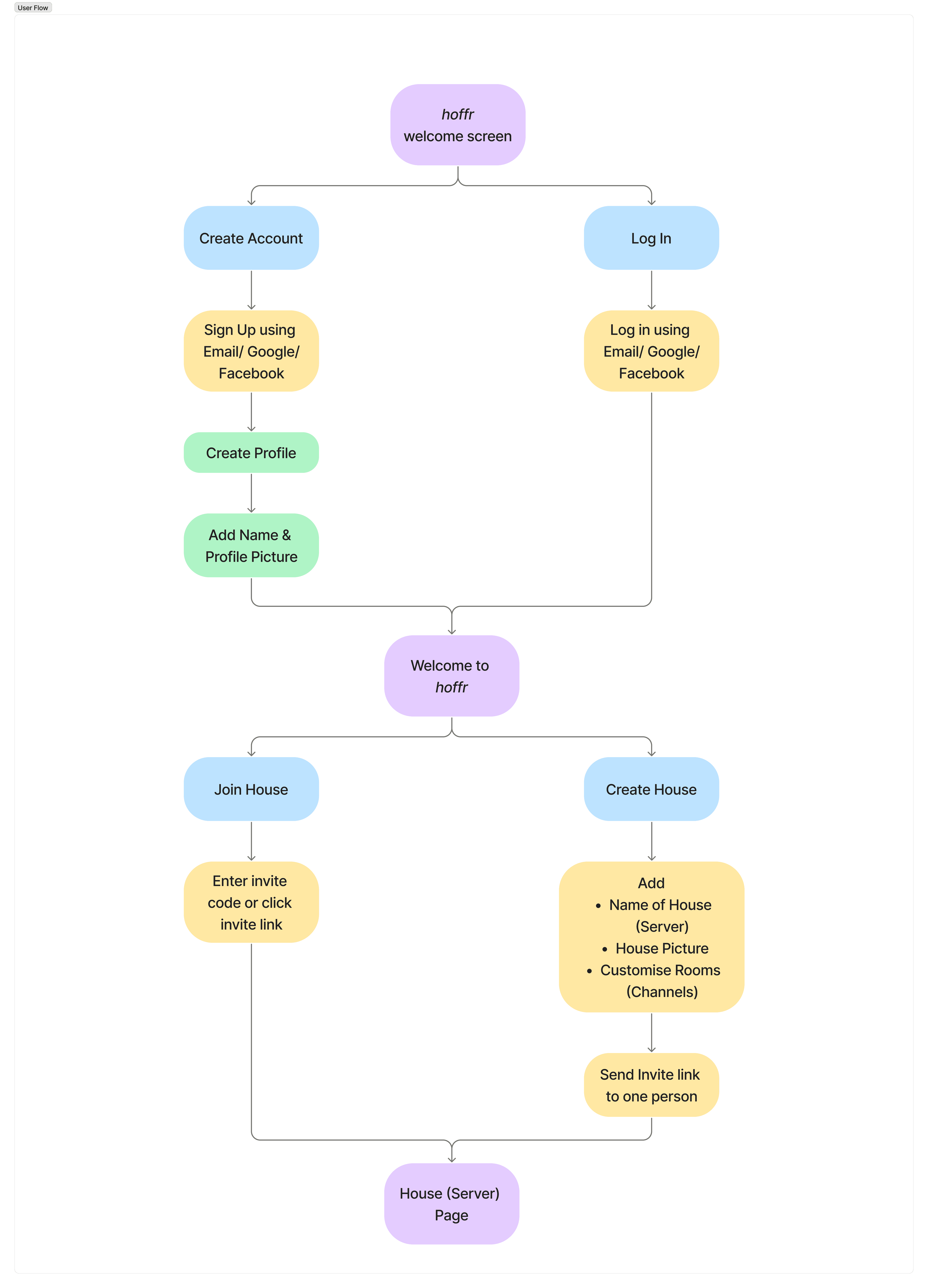
Sitemap
I created a sitemap and flow diagram keeping in mind the functional requirements and conducted a card sort using Miro to gain insight as to how the users might expect the content to be organised and displayed, and used the results to create a sitemap. Since the app was based on using a server (named as house) with channels (named as rooms), the sitemap was created to get a better understanding of the app structure, which allowed the developers to easily understand and get development on track.
Ideation
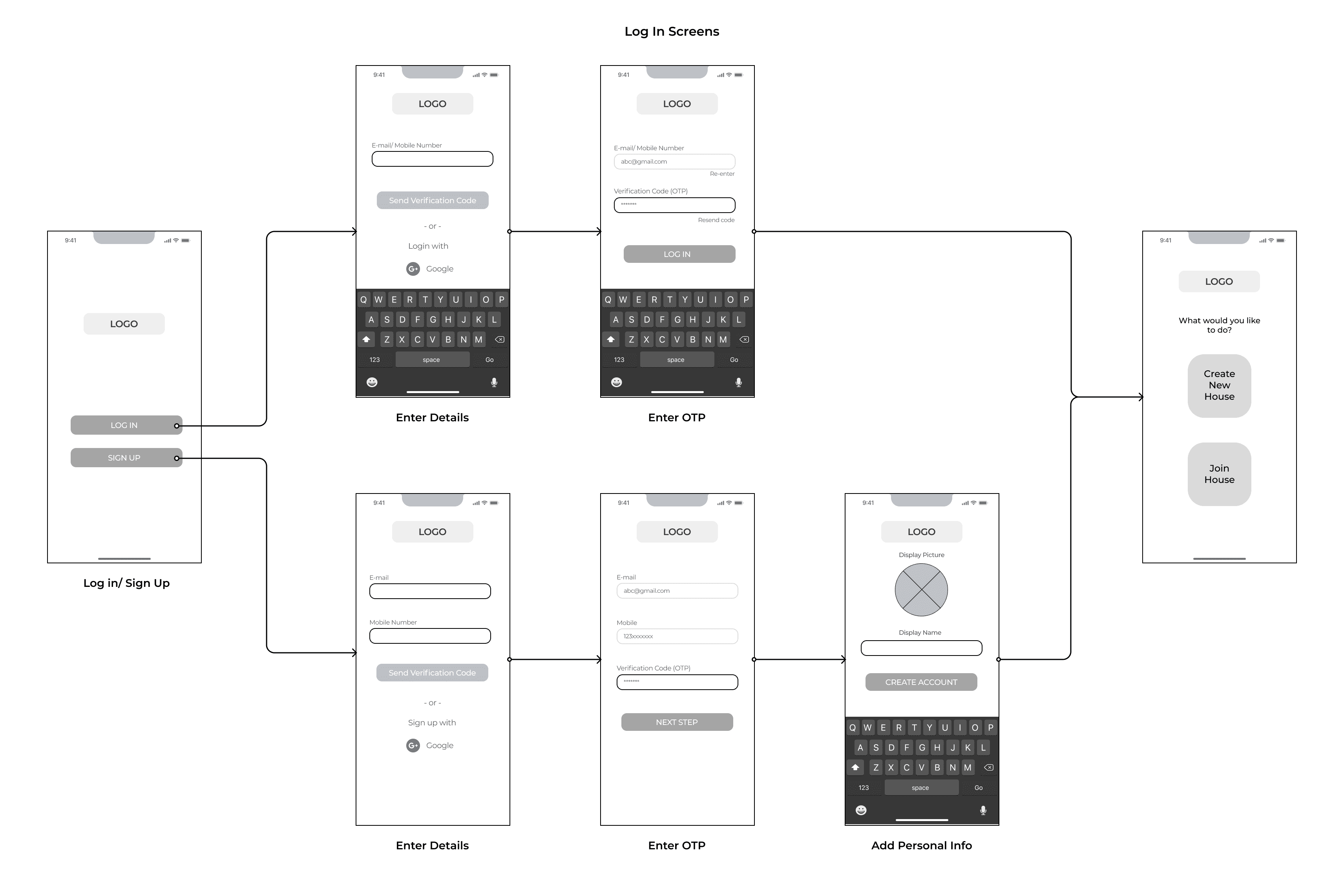
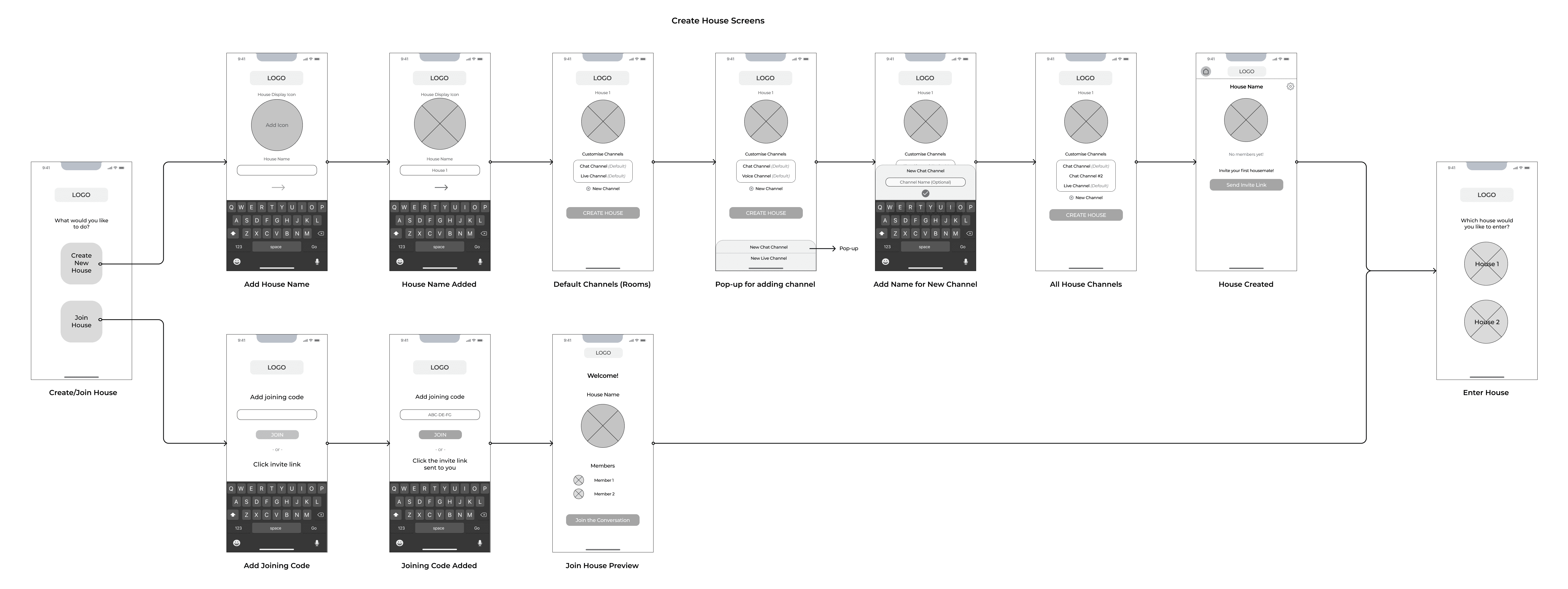
Low Fidelity Wireframes
Using my user personas, sitemap and client & functionality requirements as a guide, I created wireframes for my main screens. I created them using Figma.

Design
Mood Board
I presented the client with multiple mood boards and colour palettes. To fit their vision and look of the app they preferred using a mix of green and yellow with a minimal yet fun interface using clean illustrations and subtle design. The creation of mood boards helped me visualise the environment I was aiming for throughout the design process.

Design System
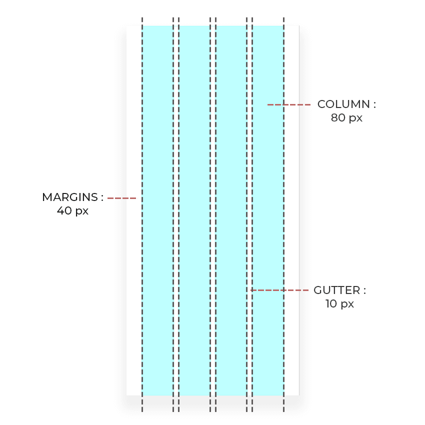
The first step was to lay the foundation of hoffr’s design system by establishing the grid that the screens will live on.
I designed using a 4-column grid system for the app. This helped me define the spacing system. Incorporating this essential step helped me create an exceptional user experience as I defined and adhered to the design standards.
UI Pattern Library
Lastly, I created a pattern library of UI components that could be followed in the future to ensure consistency throughout the app.

Colour Palette: I chose a fun pastel colour palette to give the app a playful and fun setting, which allows the user to interact more openly in the community. The pastels are less saturated than primary colours, making them feel light, soft, and calming. The use of yellow grabs the attention of the user while the blue and green give a calm and refreshing feel to the app.
Typography: The app uses the typeface ‘Montserrat’ primarily as it a easy on the eyes and calming sans serif font, which goes with the app ideology of friendship and casual interaction. The logo uses the typeface ‘Square Peg’ which is a handwritten font and gives a casual yet fun look to the logo.
Mock-ups

